Typography
Graphic Design
Brand Identity
Advertising Art Direction

ZaccheusBrutti

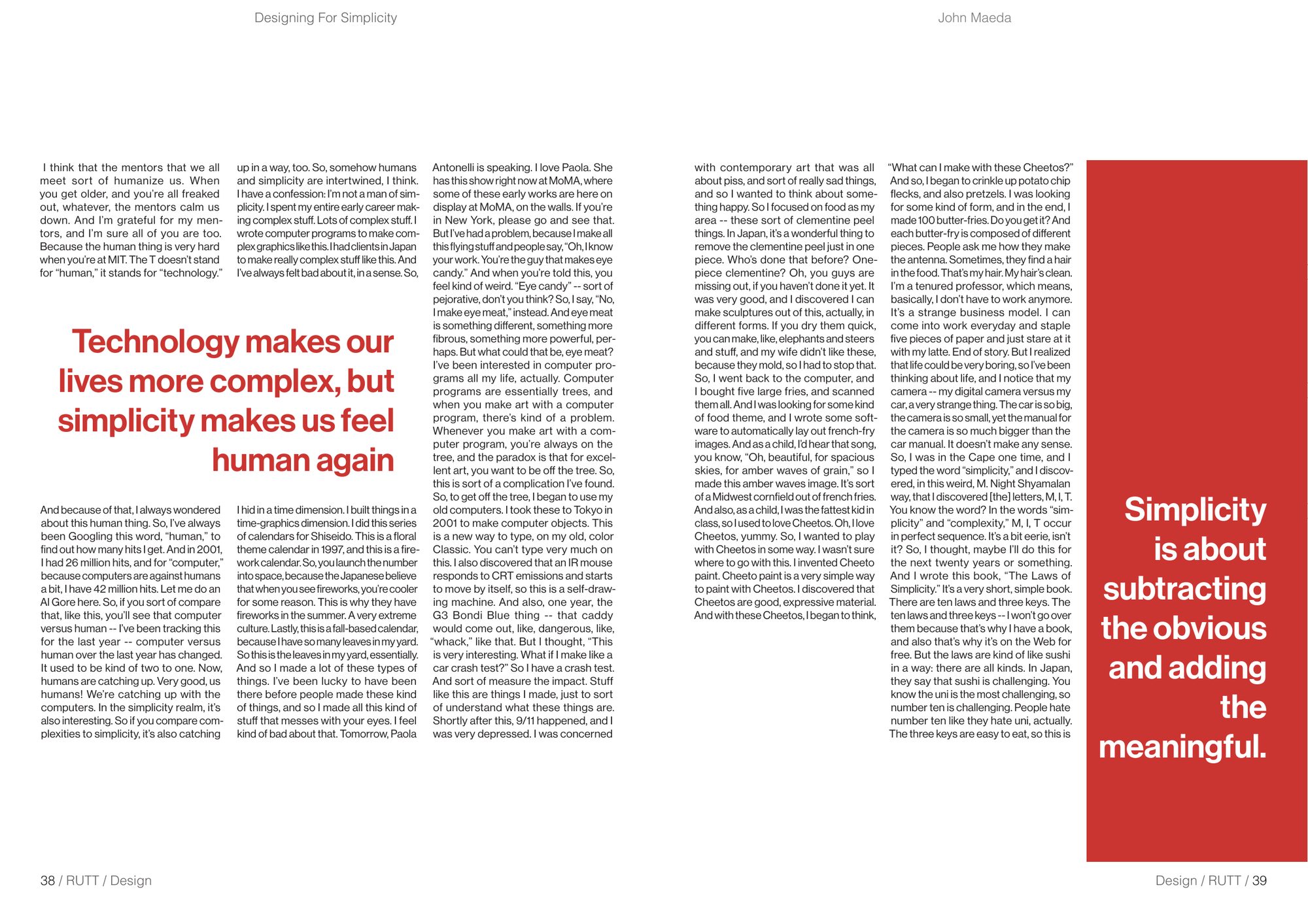
Hand-drawn self-portrait of Zach Brutti wearing red sunglasses

Graphic design student in Perth, making brands, campaigns and publications with a strong point of view.

Advertising & Graphic Design, Curtin University Get in touch ↓
Selected work
  1. 01Amaro Cocktail BookEditorial, photography
  2. 02Sufra Food TruckBrand identity
  3. 03The Taste of WAAdvertising campaign
  4. 04Hills HandymanBrand identity, real client
  5. 05RUTT MagazineEditorial, typography
01Catalogue print

Amaro Cocktail Book

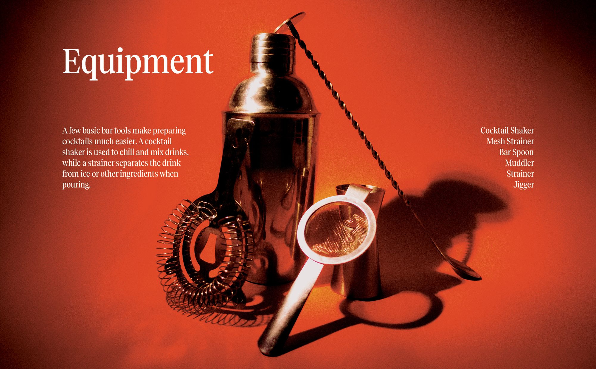
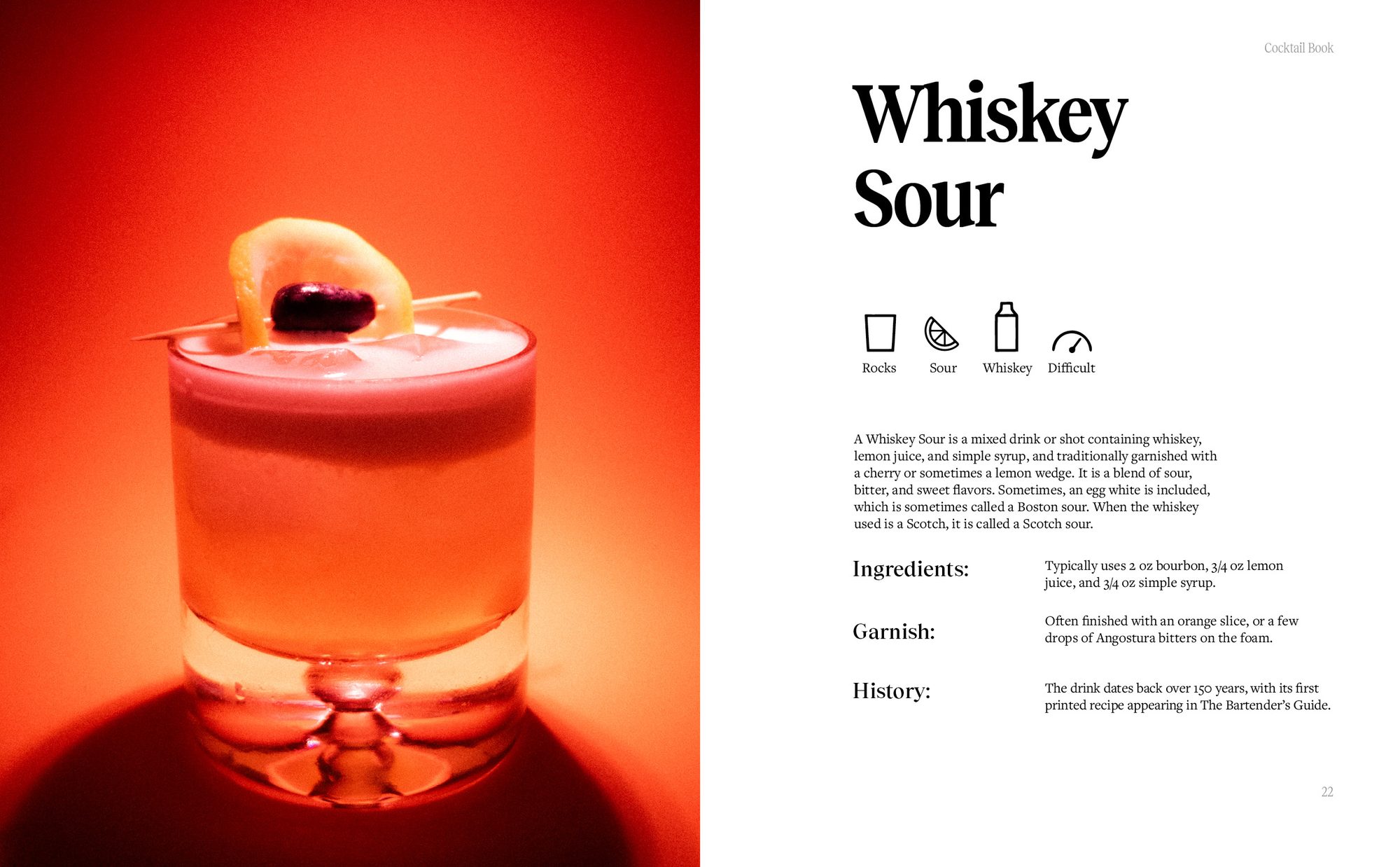
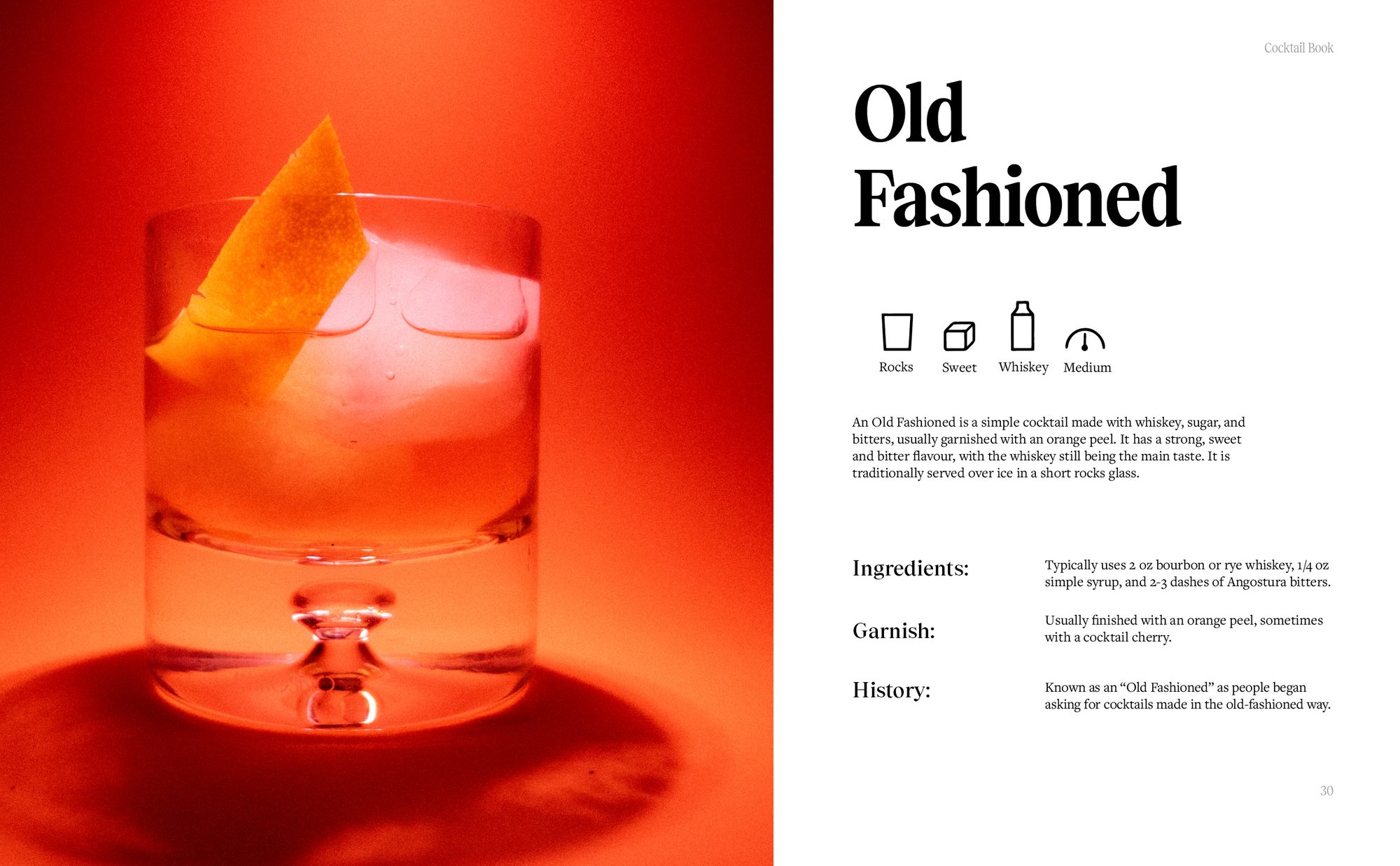
For this brief I created a 30-page, 15-spread catalogue on a topic of my choice. It had to feature at least 10 unique physical objects, along with icons and infographics, and all of the material had to be our own, so I set up a photography studio to shoot every cocktail.

After researching existing catalogues, I mixed European lifestyle magazines with cocktail recipe books to make a coffee table look book, something I could imagine other designers owning. I built the book around orange and amber, using photo editing to give the images a strong, distinctive look that sells a European lifestyle through cocktails.

Type
Editorial design, photography
Format
30 pages, 15 spreads
Equipment spread with cocktail tools lit in red
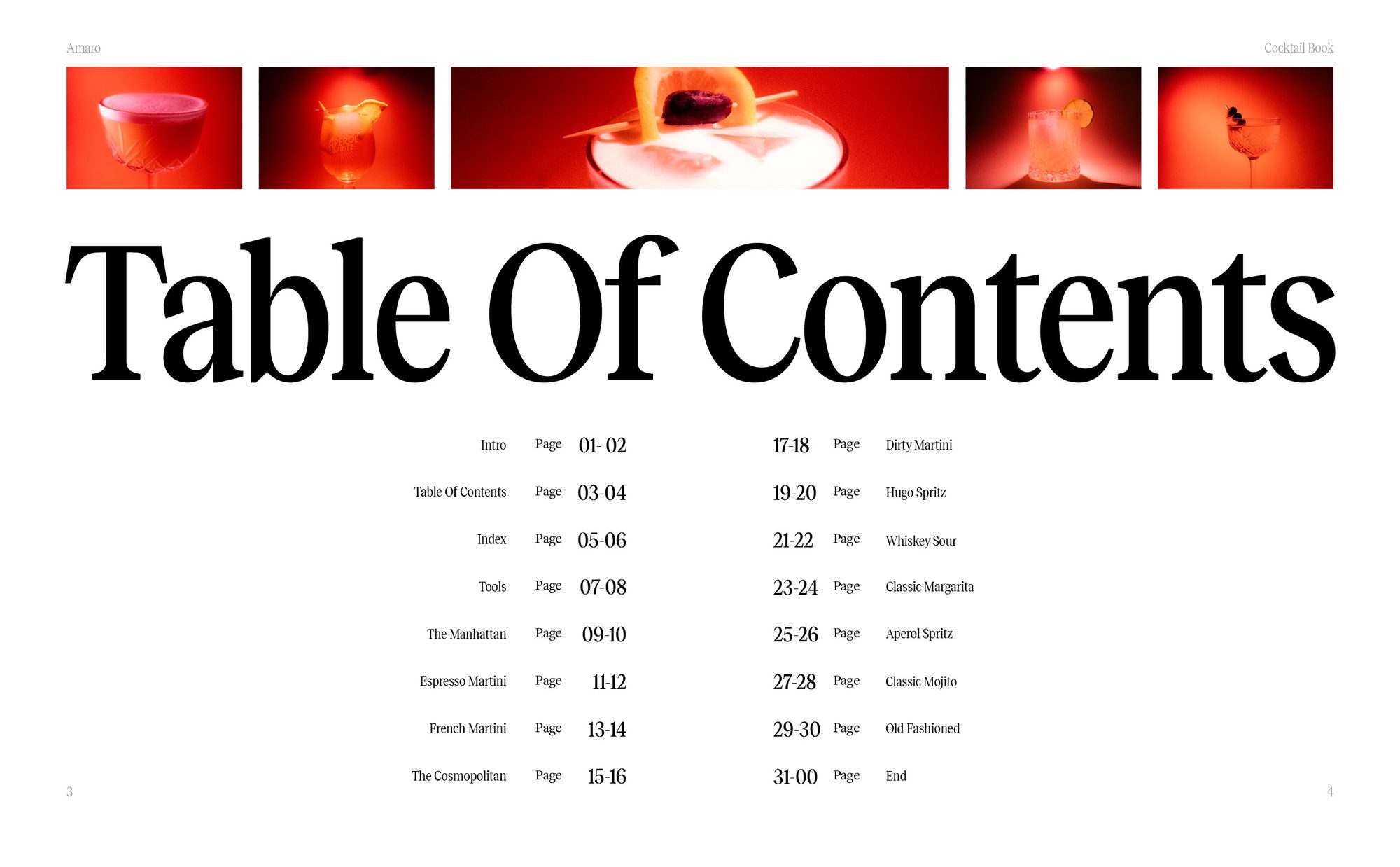
Table of contents spread
Whiskey Sour recipe spread
Old Fashioned recipe spread
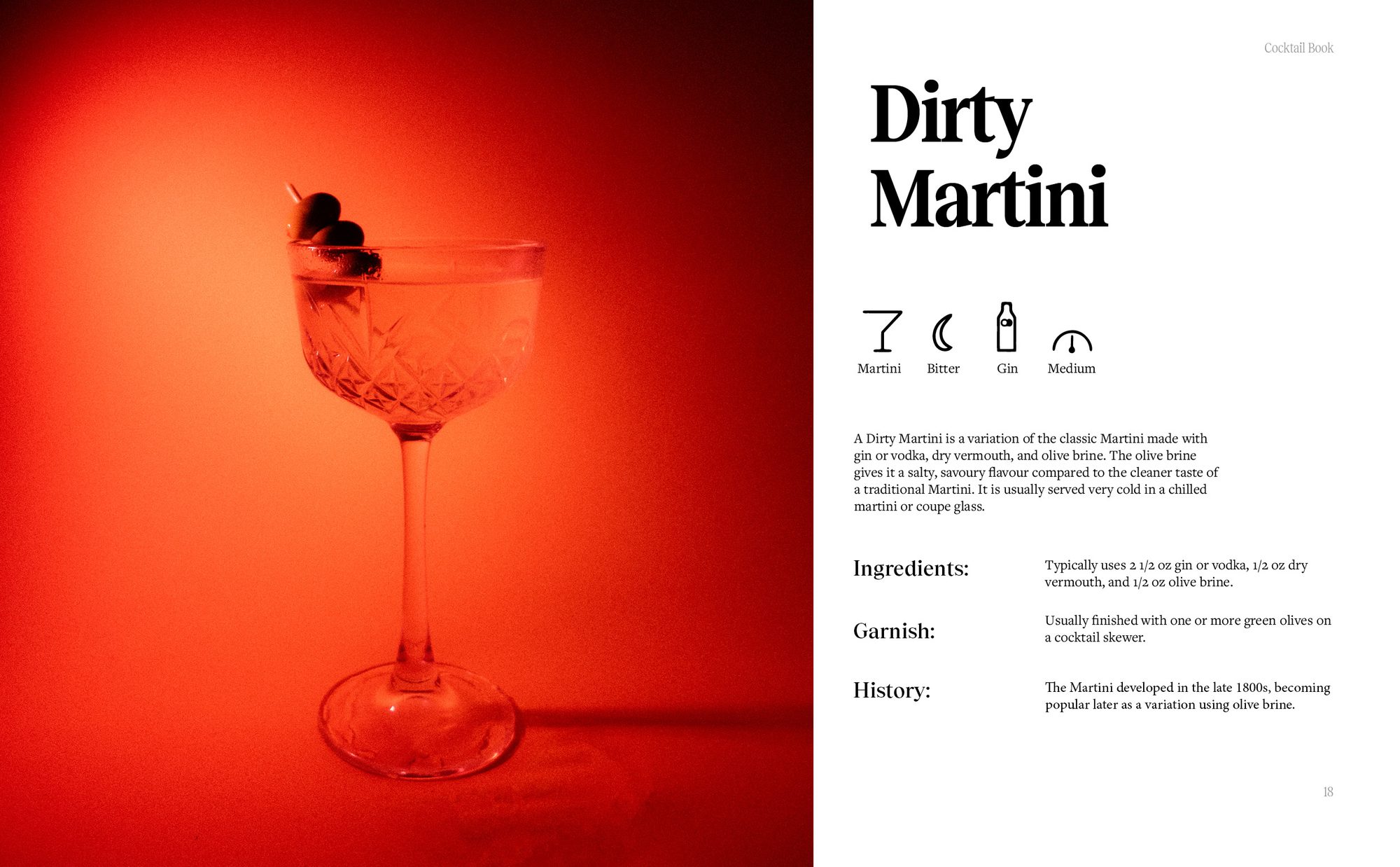
Dirty Martini recipe spread
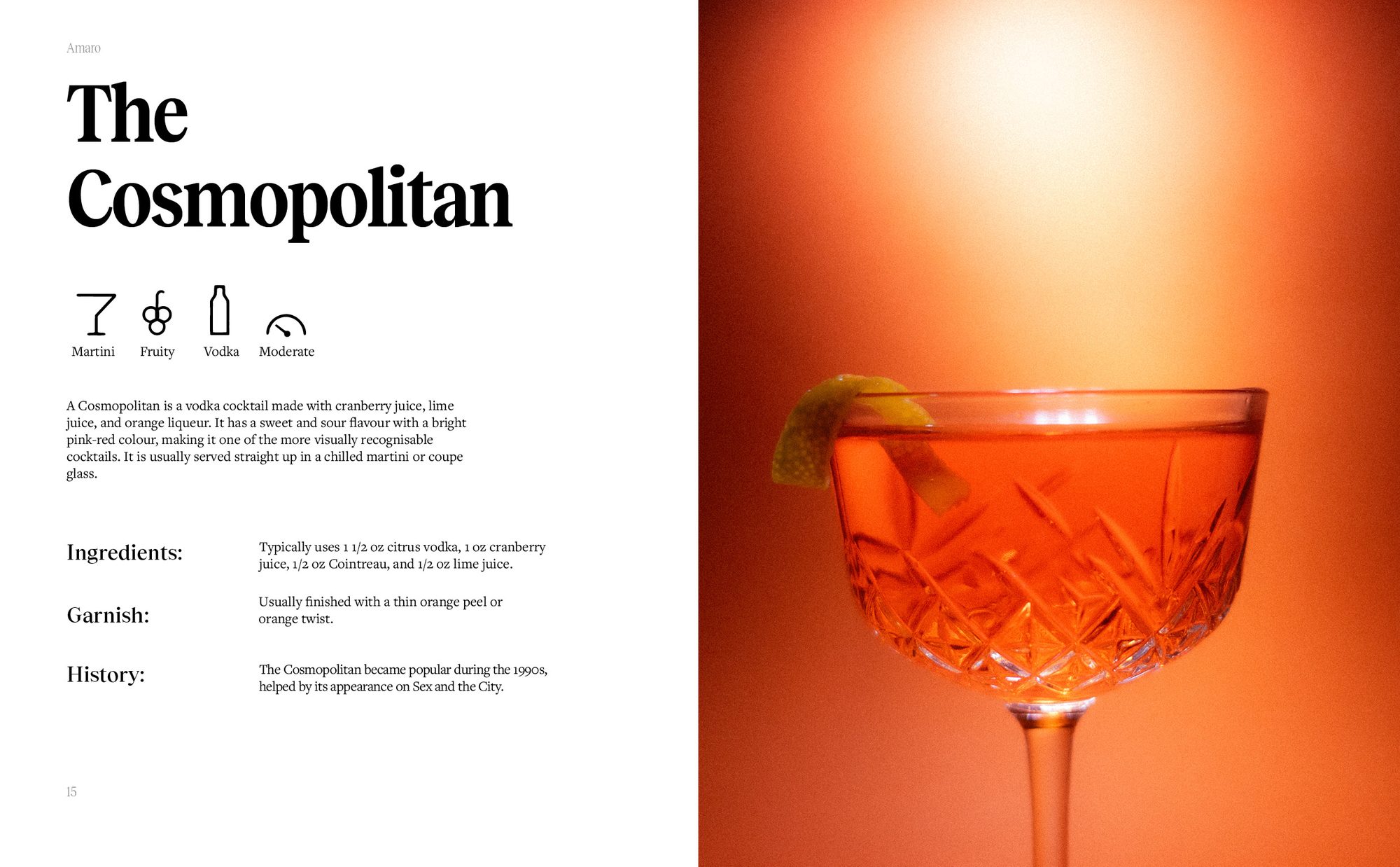
Cosmopolitan recipe spread
02Brand identity

Sufra Food Truck

The brief was a brand identity for a food truck on our campus, built around an assigned country. I was given Iran. After researching the campus demographics, I aimed the truck at groups of culturally diverse students looking for affordable meals. Researching Iran's relationship with food led me to the name Sufra, which describes sitting down to share food around a tablecloth.

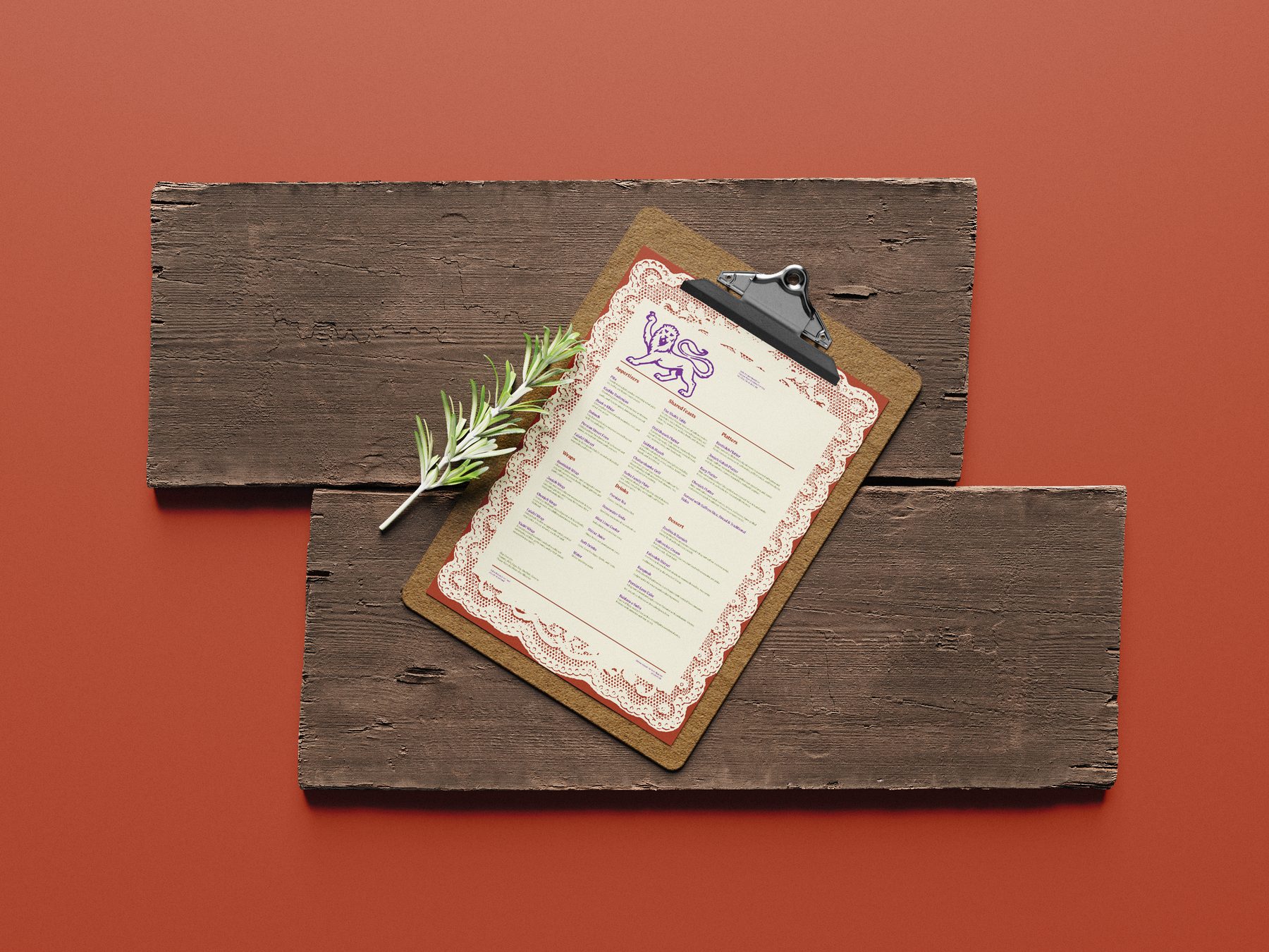
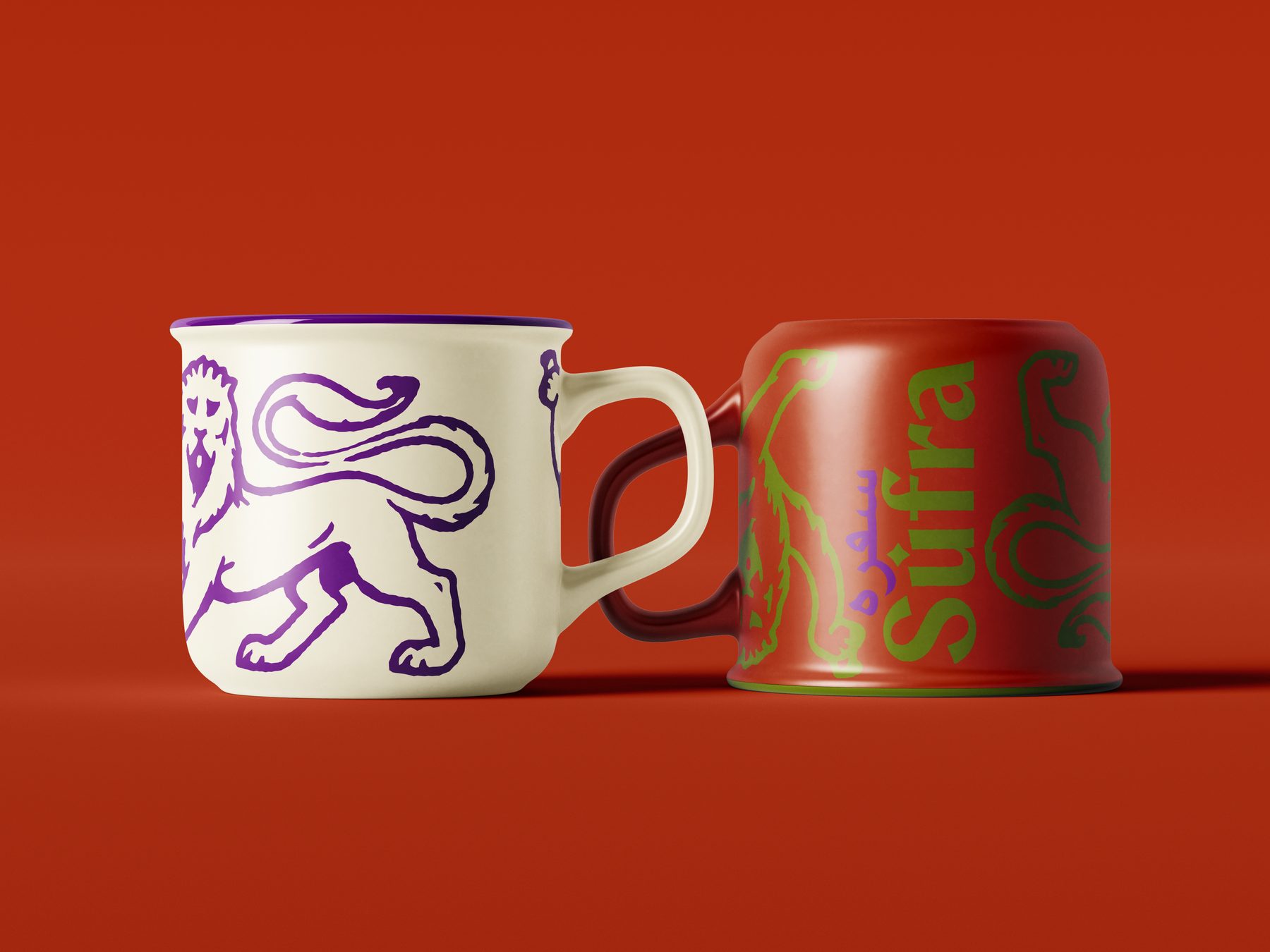
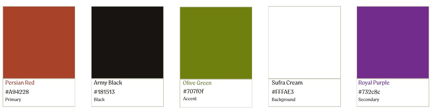
Rich purple, olive green and rusty orange tie back to Iran's cultural identity, as these colours appear throughout its written history and architecture. The rollout included a menu, merchandise and mock-ups to show the full brand in use.

Type
Brand identity, collateral
Type­faces
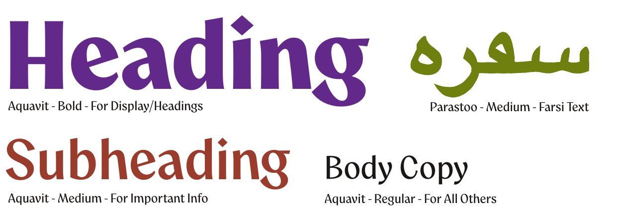
Aquavit, Parastoo
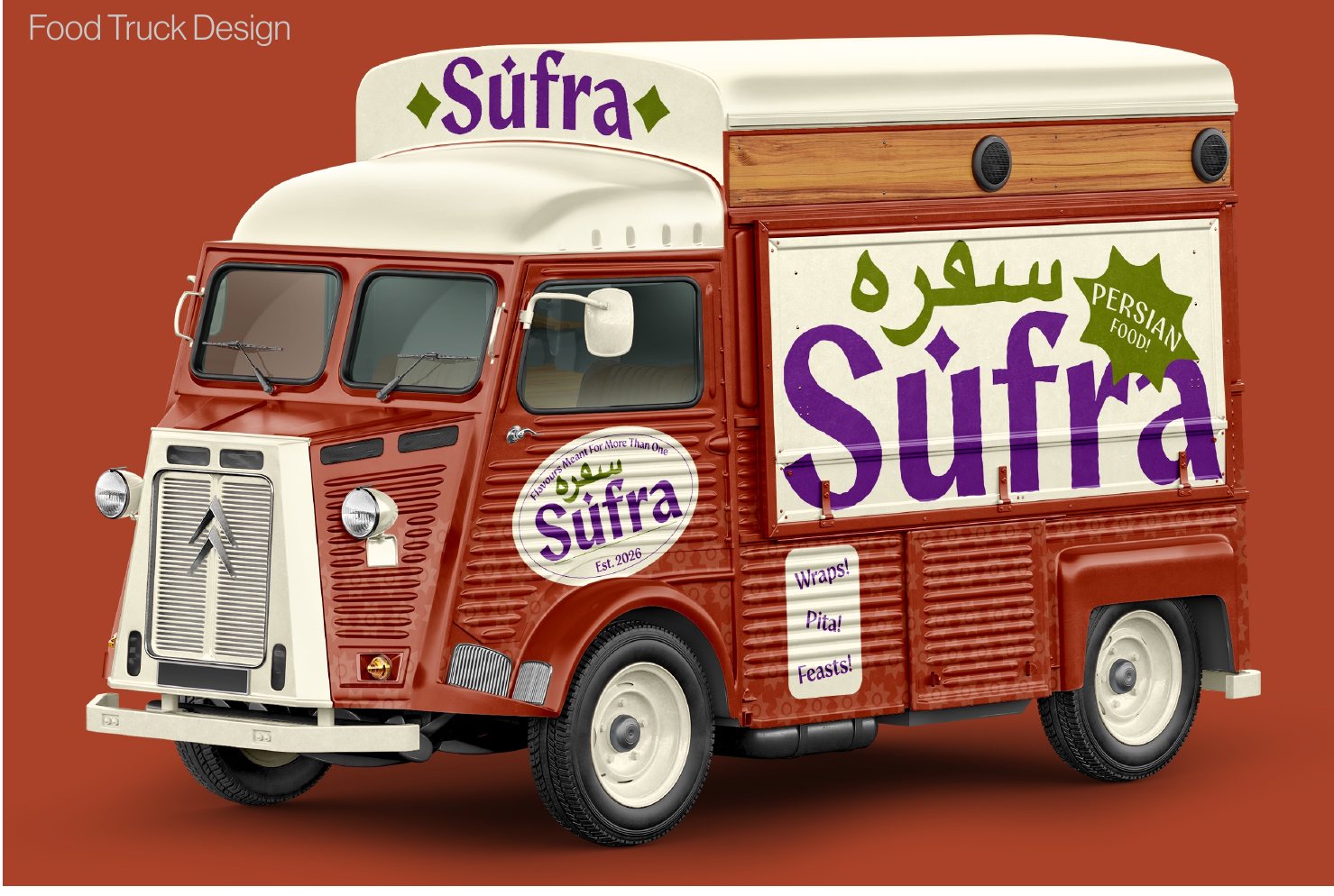
Sufra food truck mock-up
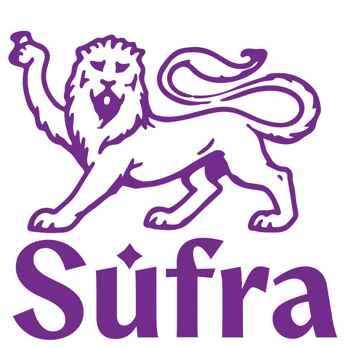
Sufra lion logo in purple
Sufra menu on a clipboard
Sufra enamel cup merchandise
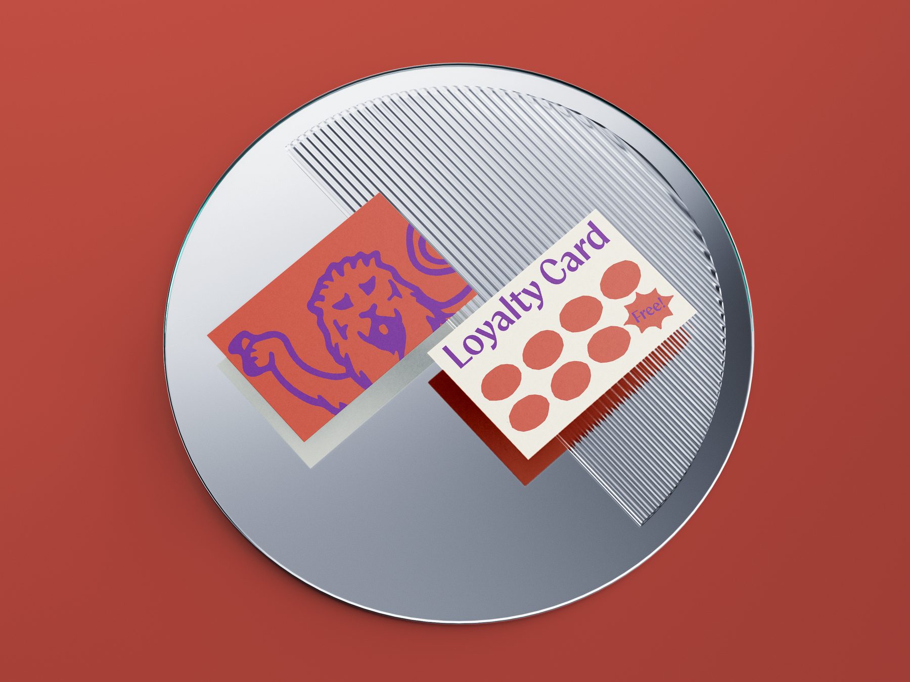
Sufra loyalty card
Sufra colour palette
Sufra typography system
03Advertising campaign

The Taste of WA

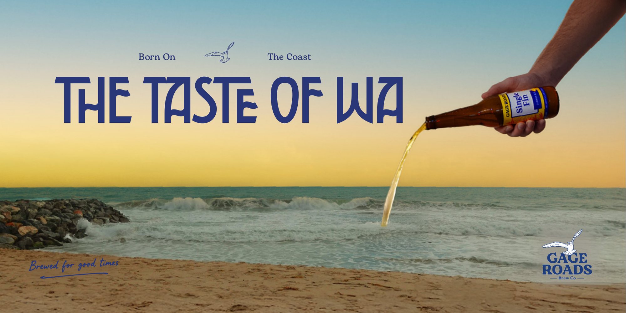
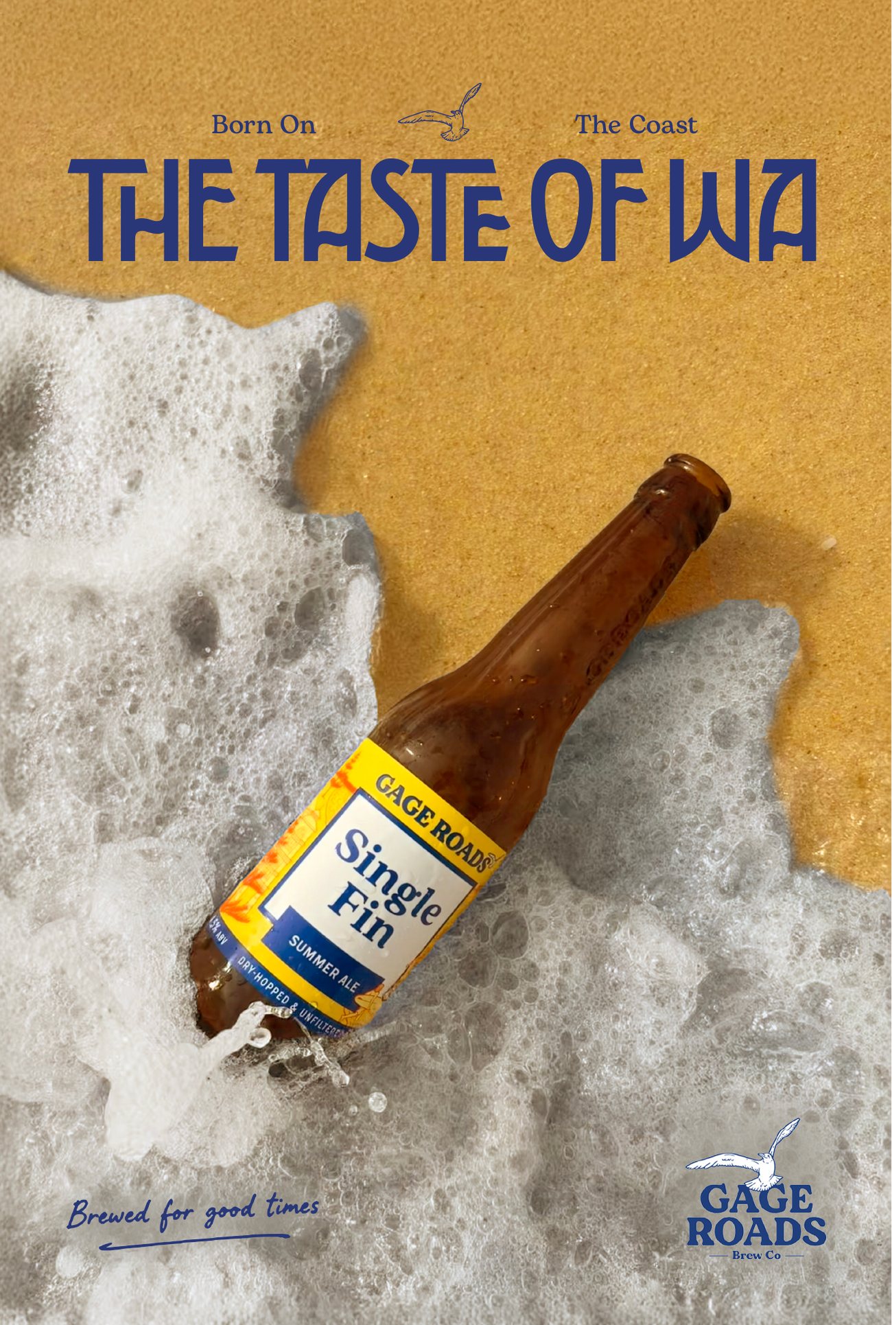
The brief was a billboard and Adshel campaign for an Australian brand of our choosing, defining the single-minded proposition, target audience and feeling of the ad while staying true to the brand's existing identity. I chose Gage Roads, an independent brewery from Perth.

I aimed the campaign at young Australians who value local brands, with the SMP "The Taste of WA". I linked iconic WA scenery, especially the beach, to the taste of a Gage Roads beer. After a few sketch mock-ups, I settled on beers sitting in the waves and pouring over the coast. Apart from the logo, I created every element myself, including the photography and type layout.

Client
Gage Roads Brew Co (student brief)
Format
Billboard, Adshel poster
Billboard showing beer pouring over the WA coastline
Adshel poster with a beer bottle in the waves
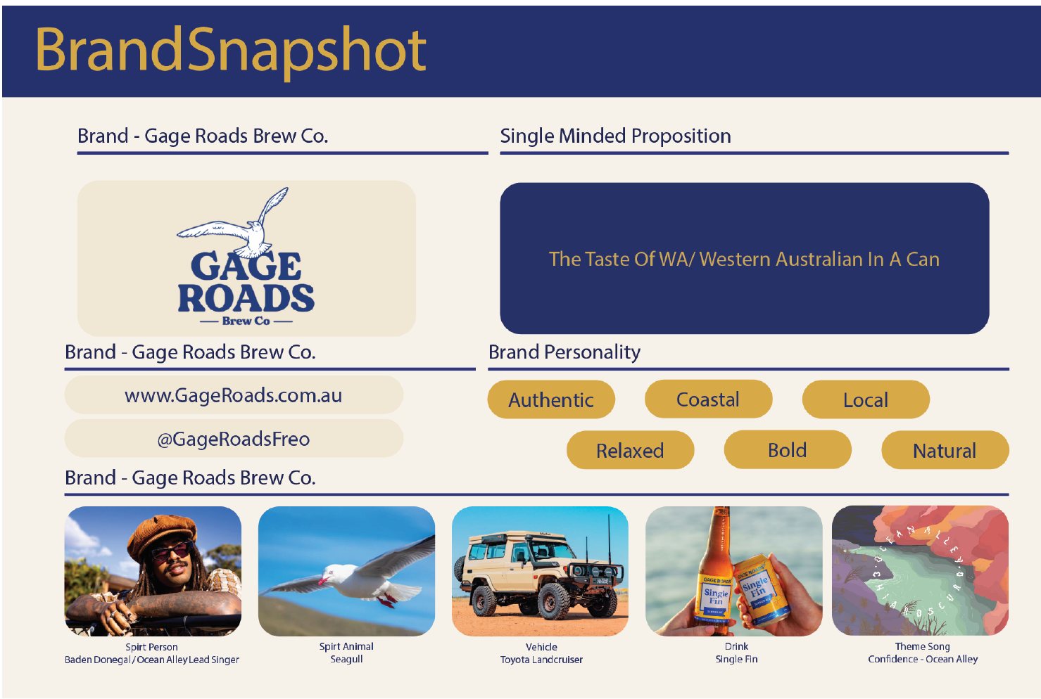
Brand snapshot page from the process diary

From the process diary: a brand snapshot mapping Gage Roads' audience, personality and the single-minded proposition before any layouts were made.

04Brand identity, real client

Hills Handyman

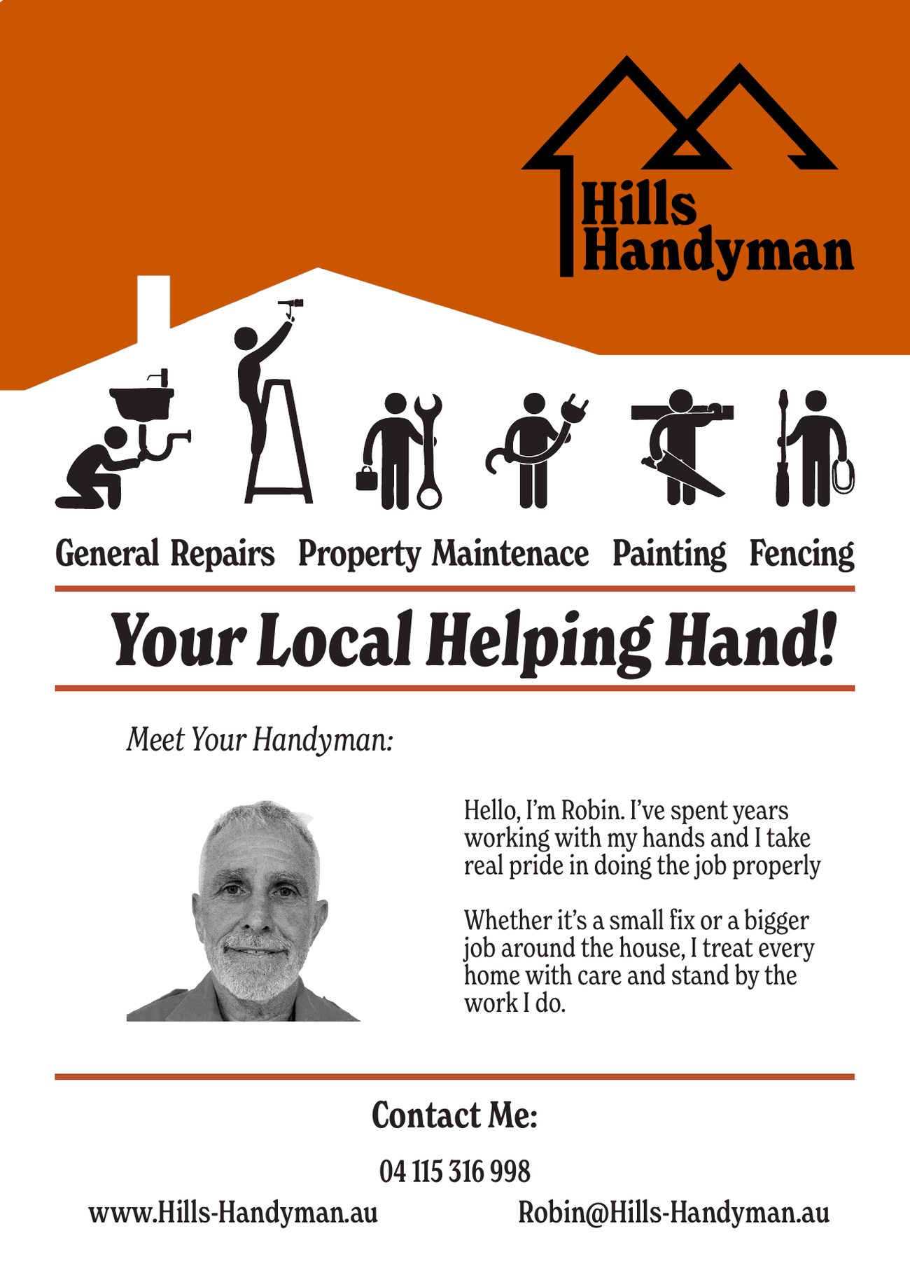
My first project for a real client, and my first time designing around what someone else thought looked good rather than just my own eye. Robin is a tradesman starting his own handyman business. Together we narrowed his audience to older residents of the Perth Hills, his most frequent customers.

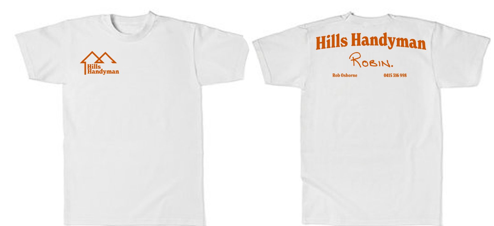
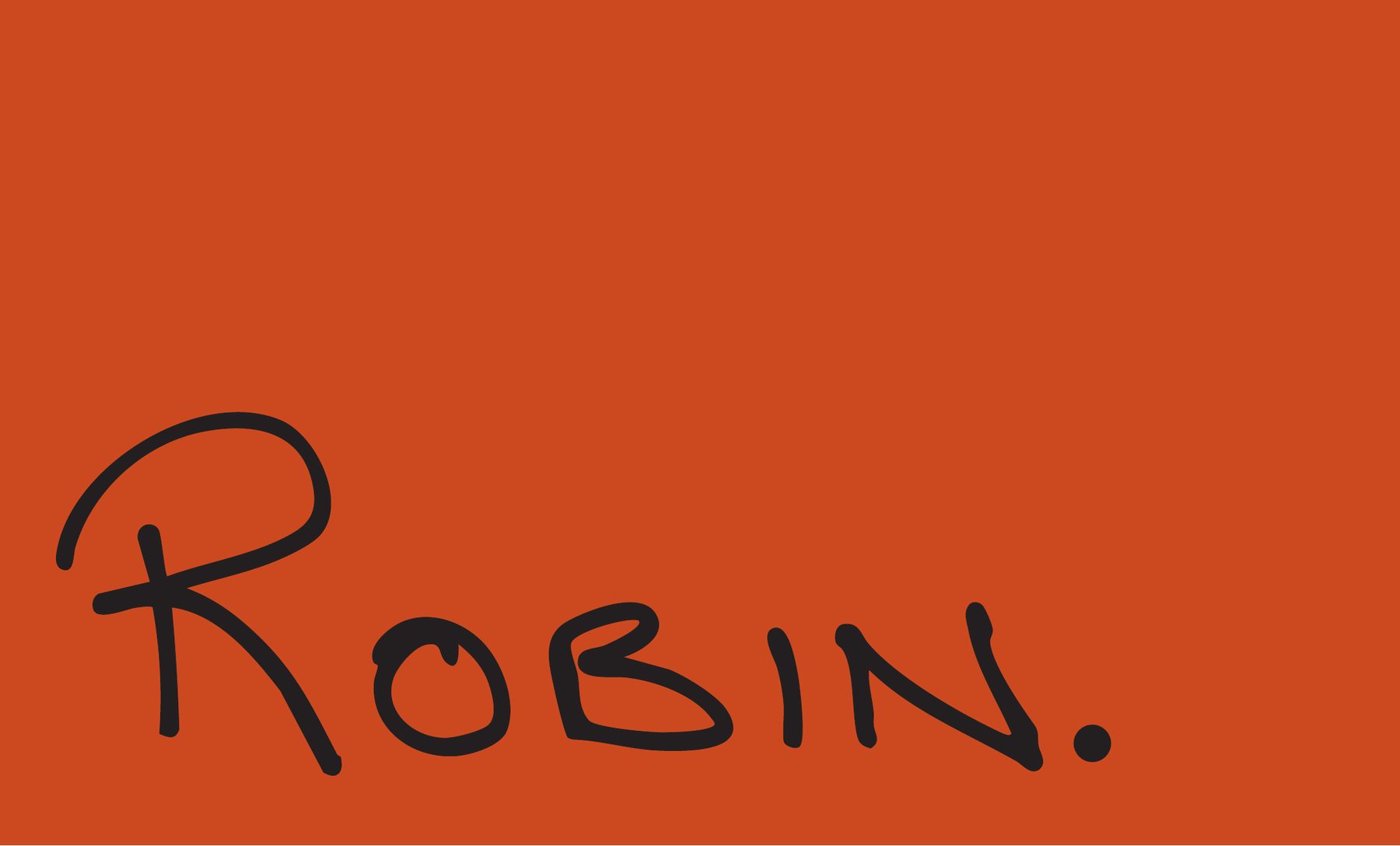
I wanted the brand to feel timeless with a touch of retro, so we settled on burnt orange with a soft serif to keep it casual and friendly. I pushed it in a personal, "one man army" direction by having Robin write out his name, which I scanned and used on his business card and shirts.

Client
Hills Handyman, Perth Hills
Deliverables
Logo, cards, flyers, shirts
Hills Handyman logo
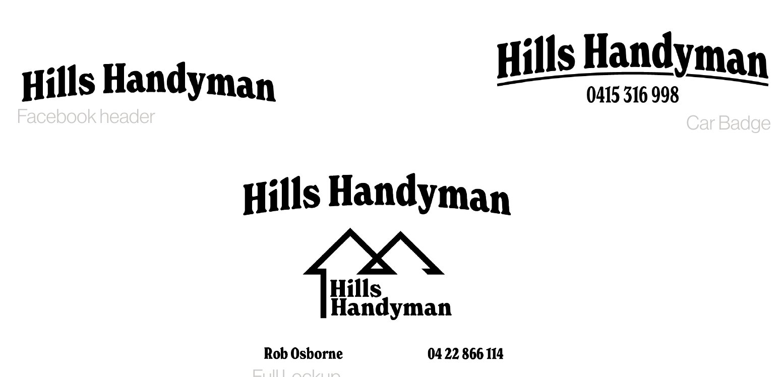
Hills Handyman logo variations
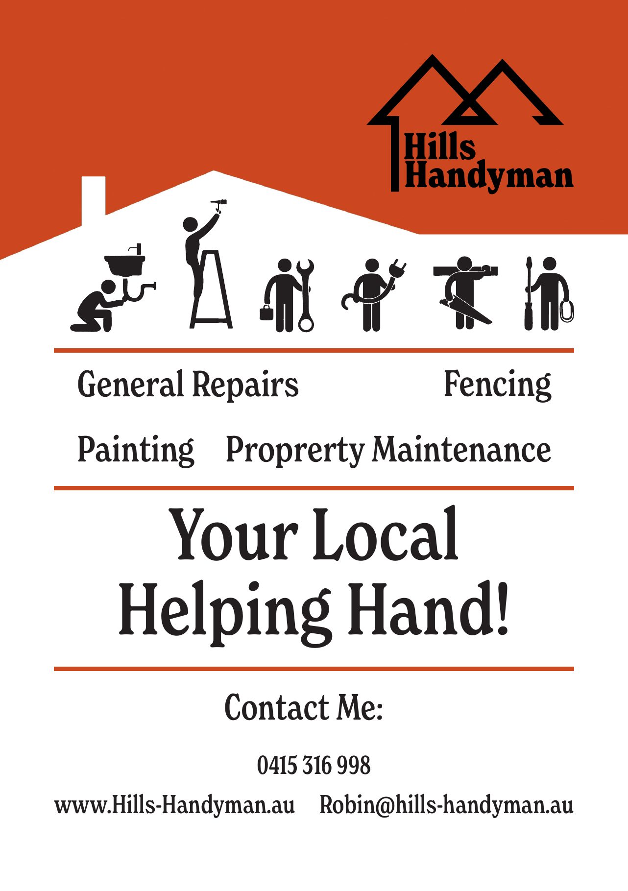
Hills Handyman A4 flyer
Hills Handyman A5 flyer
Hills Handyman shirt mock-ups
Business card front with Robin's handwritten name
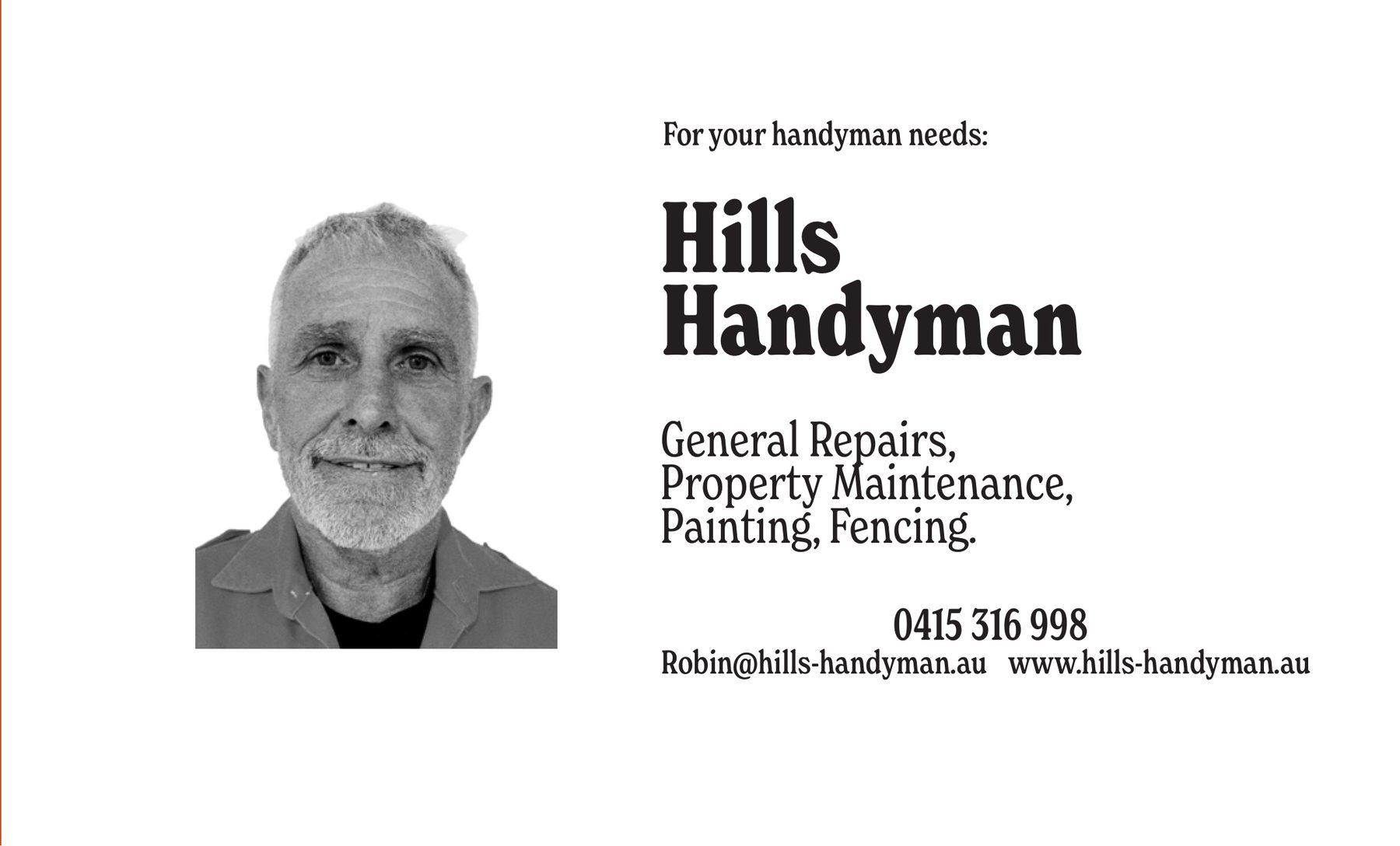
Business card back
05Magazine design

RUTT Magazine

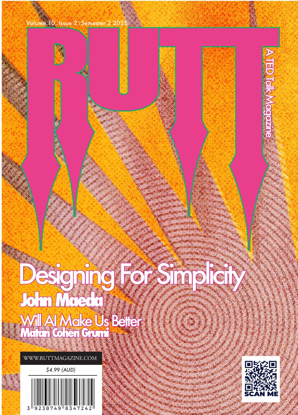
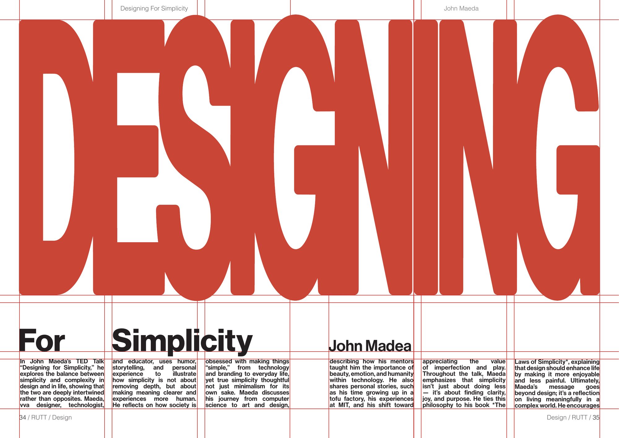
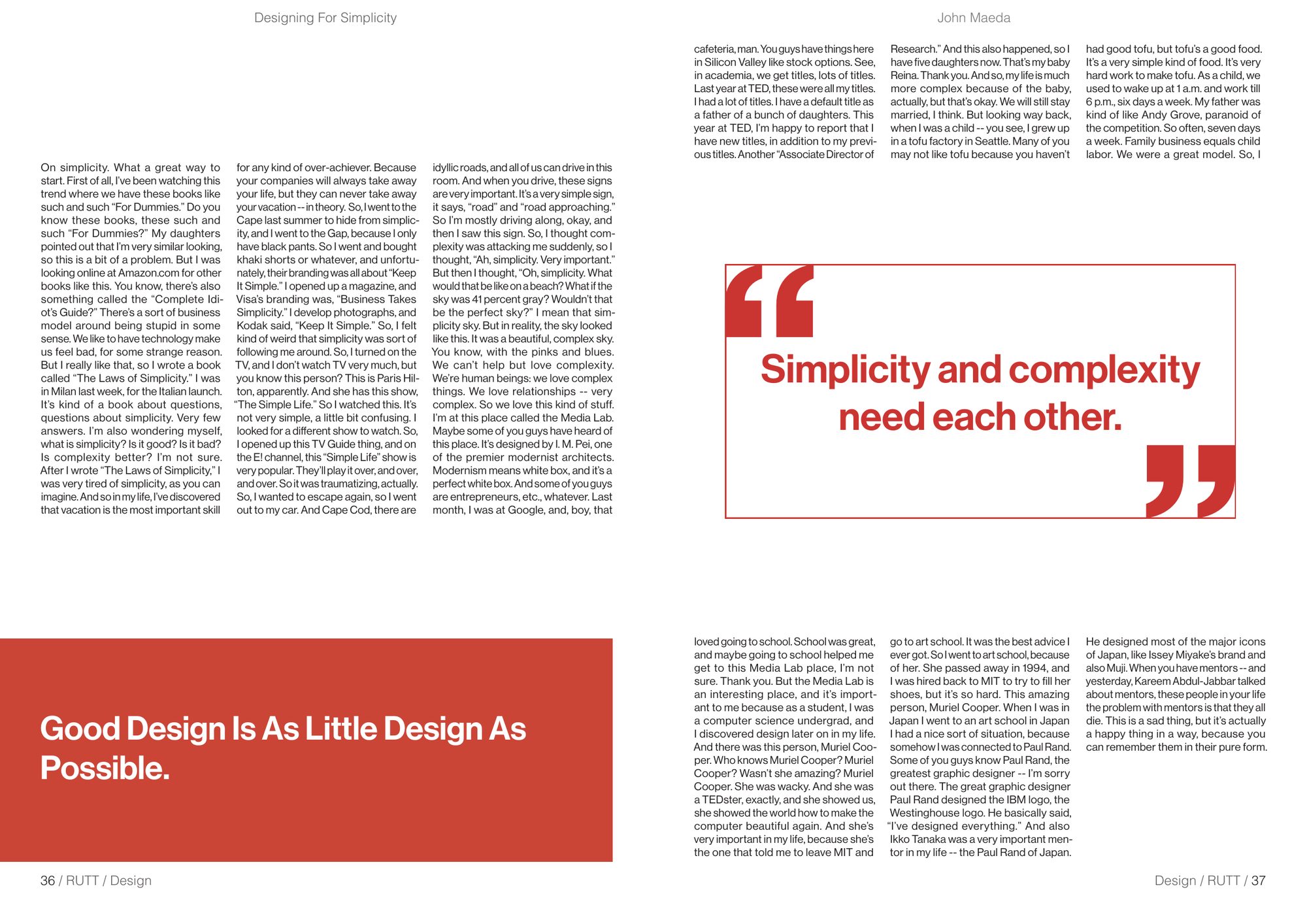
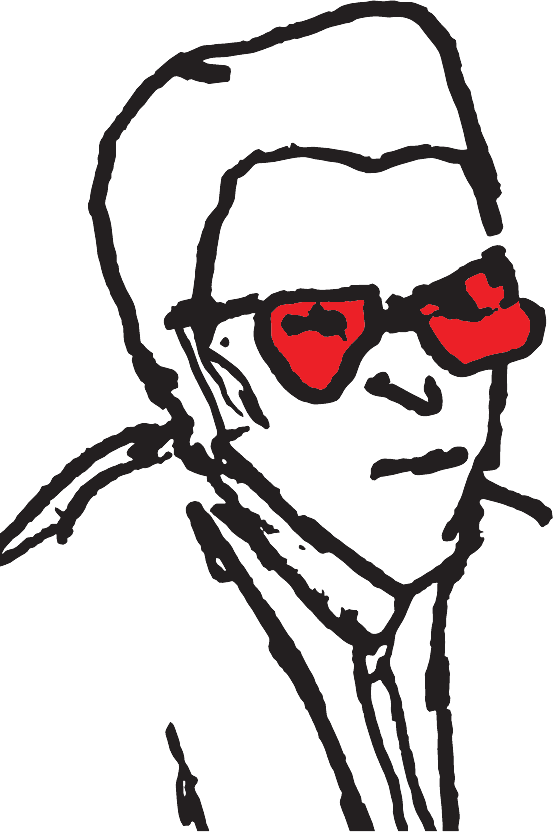
One of my earlier works, and one that pushed me into design applications I hadn't used before. It's a typographic study of the ideas and visual language of John Maeda's TED Talk on designing for simplicity, set out as a three-spread article with a separate cover for a fictional magazine.

The talk led me to Swiss Style, with its heavy box grids and "never break the grid" mentality, since its structure and minimalism reflect simplicity in its rawest form. Keeping the spreads simple while still visually interesting was a challenge. For the cover I went the other way, loud and heavy with texture, to contrast with the spreads.

Type
Editorial design, typography
Year
2025
RUTT magazine cover
Opening spread with large DESIGNING headline
Second article spread
Third article spread